Kanda x Japan Localization Thesis
My Role
UX Research
UI Design
Project type
AP Thesis Project
Work Project
Deliverables
Figma Prototype
Wordpress Site
Report
Duration
10 weeks
Overview
Project introduction
This was my AP Thesis Project working with my Internship company Kanda.
In this project, I explored how to effectively localize a website for Japanese customers to improve accessibility, build trust, and increase engagement.
Kanda
Kanda operates in Aarhus, Denmark, and has expertise in VR-based safety training for wind turbine technicians. Their primary customers are training providers that use their VR software to certify trainees.
The company wanted to signal its commitment to working with Japanese clients, but their existing website failed to align with Japanese business expectations. This project focused on adapting the site’s content, structure, and visual design to fit the Japanese market.
Desk Research
Japanese Culture
In Japan, things like respect, hierarchy, and group harmony shape how people make decisions and do business, so ignoring those details can create confusion or even push potential partners away.
Covering this in my project was really valuable because it helped me design a solution that was understandable and familiar to Japanese users.
Japanese Web Design
Japanese websites differ significantly from Western designs. Key characteristics include:
Dense information layouts. Users expect detailed content upfront.
Minimal whitespace. Space is optimized to display maximum information.
Bright, contrasting colors. Colors like red and blue are often used to highlight important content.
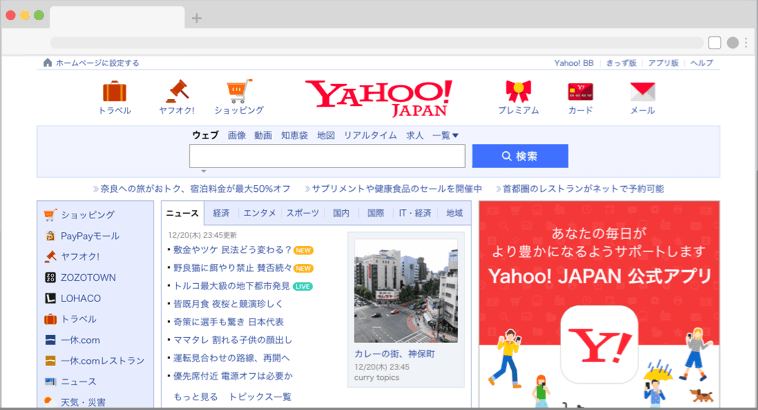
Yahoo Japans Website in present day - displaying some of the key my key findings from this research
Localization
Defined as: "The process of organizing a business or industry so that its main activities happen in local areas rather than nationally or internationally” - Cambridge Dictionary.
Localized designs are intended to cater to how the design fits into the culture and better display important information in a contextually relevant way.
Defining the Space
Effort vs Impact Matrix
To prioritize the most critical pages for prototyping, I created an effort vs. impact matrix. By plotting the effort required against the potential impact of each page, I could deduce which pages would be most important to make for the first prototype version of the page. This matrix served as a roadmap for determining where to concentrate design efforts.

Card Sorting
To then gain a better understanding of what should be on every page, I conducted a card sorting exercise with testers from my target group. This gave me a better understanding of where elements should go based on my target audiences expectations.
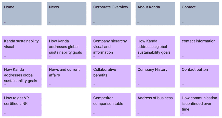
A section of my card sorting exercise
Ideation
Tone of Voice Guide
I created a tone of voice guide to help me later when it came to content creation and to influence content in my mood board. It was established so all details were easily understood and nothing was left ambiguous. This approach is particularly important for Japanese business culture, which values precision and clarity in communication.
My findings/guiding adjectives were as follows:
Warm and welcoming
Clear and thorough
Professional, Trustworthy, Corporate
Culturally sensitive
Engaging and Empathetic
Inspiration
I drew inspiration from various Japanese GWO adjacent sites. Here are some examples:
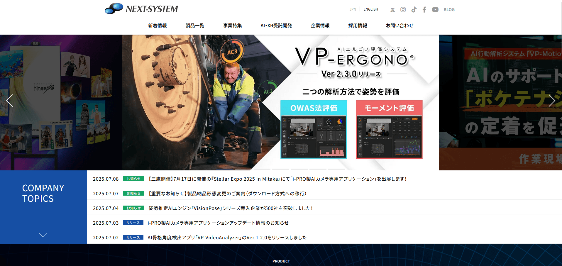
Next-Systems landng page - A B2B Japanese company whose website I used as inspiration
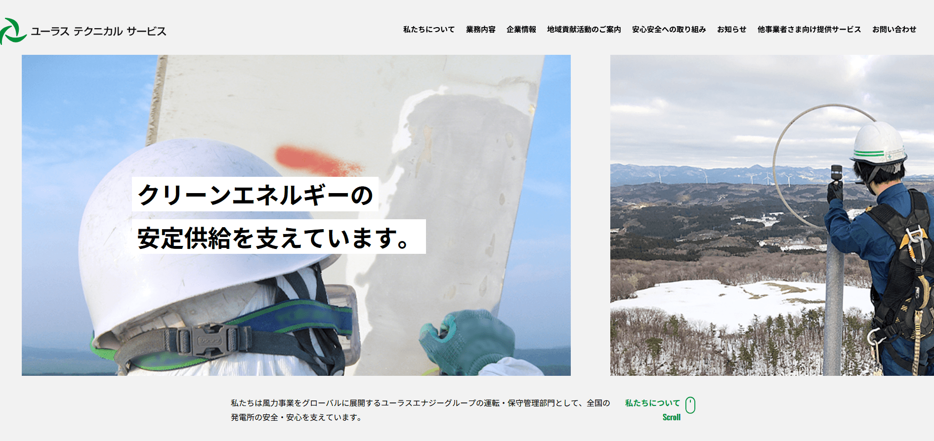
Japanese GWO provider - Eurus Technical Service
Prototyping & Testing
Lo-Fi & Hi-Fi Prototyping
These prototypes represent the culmination of all the research, planning, mappings, and design decisions made throughout the project. Both were tested on using think aloud and AB testing. Done with people from the target group to make refinements.
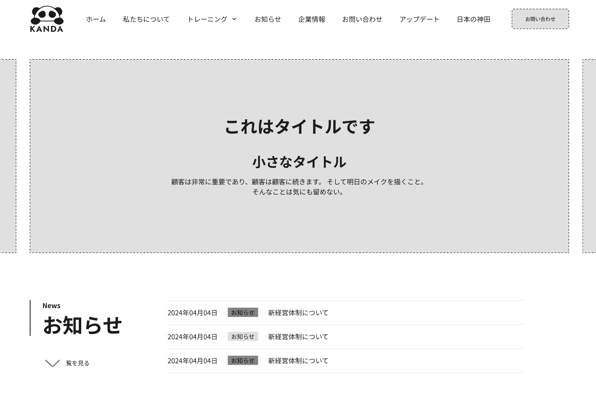
Hero section of Home page - Lo-Fi
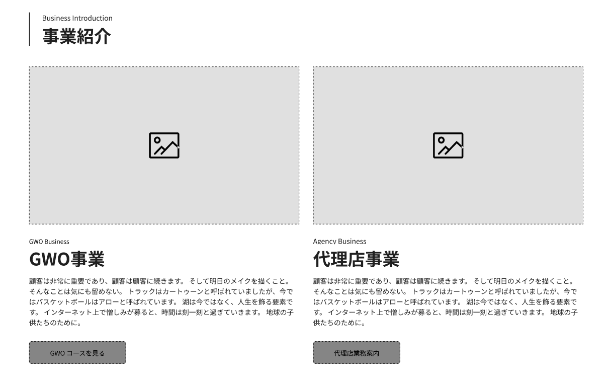
Business Introduction on Home page - Lo-Fi
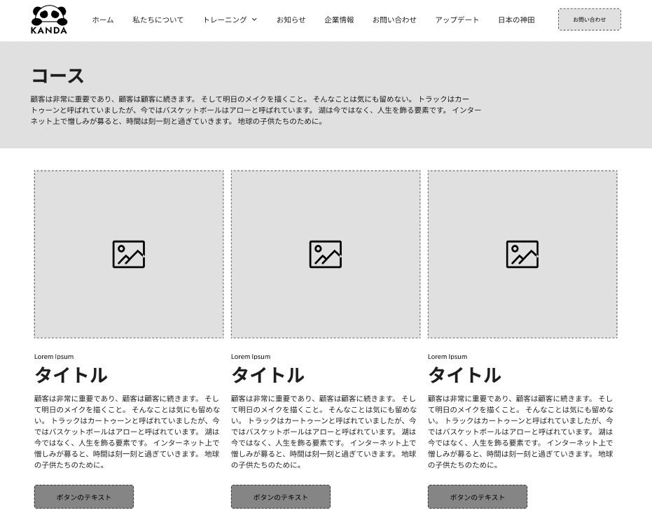
Courses Page - Lo-Fi
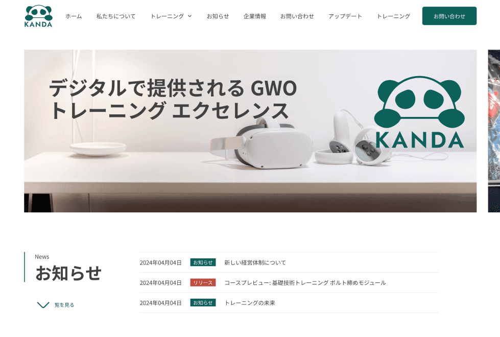
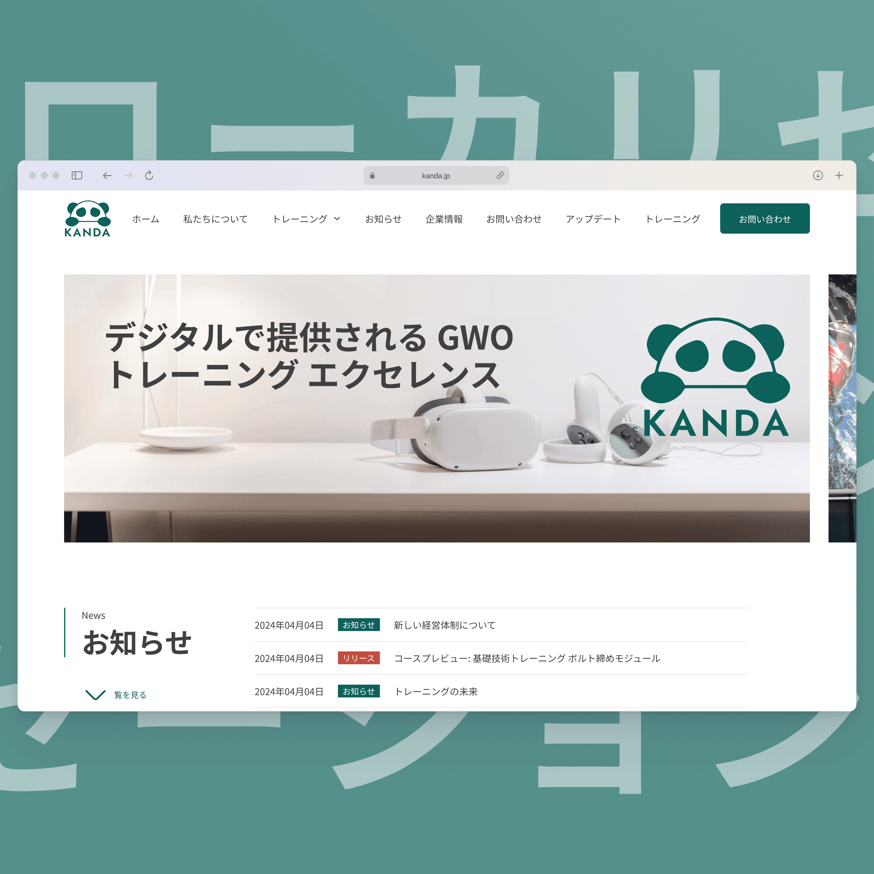
Hero section of Home page - Hi-Fi

Business Introduction on Home page - Hi-Fi

Business Introduction LoFi version on Home page - Hi-Fi
Key Learnings
Professional
Localization Research • Cross-Cultural UX Design • Experience Mapping • Effort vs. Impact Analysis • Card Sorting & Information Architecture • A/B Testing • Design System Development • Bilingual Content Strategy • WordPress Implementation
Personal
Cultural Sensitivity • Strategic Thinking • Adaptability • User-Centered Design Mindset • Clear Communication • Independent Problem-Solving • Iterative Design Process • Attention to Detail
The Outcome
The final localized website helps Kanda communicate more effectively with Japanese training providers by aligning with their cultural expectations, values, and design standards.
Please feel free to view my Figma Prototype or WordPress Prototype. If you have any questions don't hesitate to reach out as well.